Wayfinding & Directional
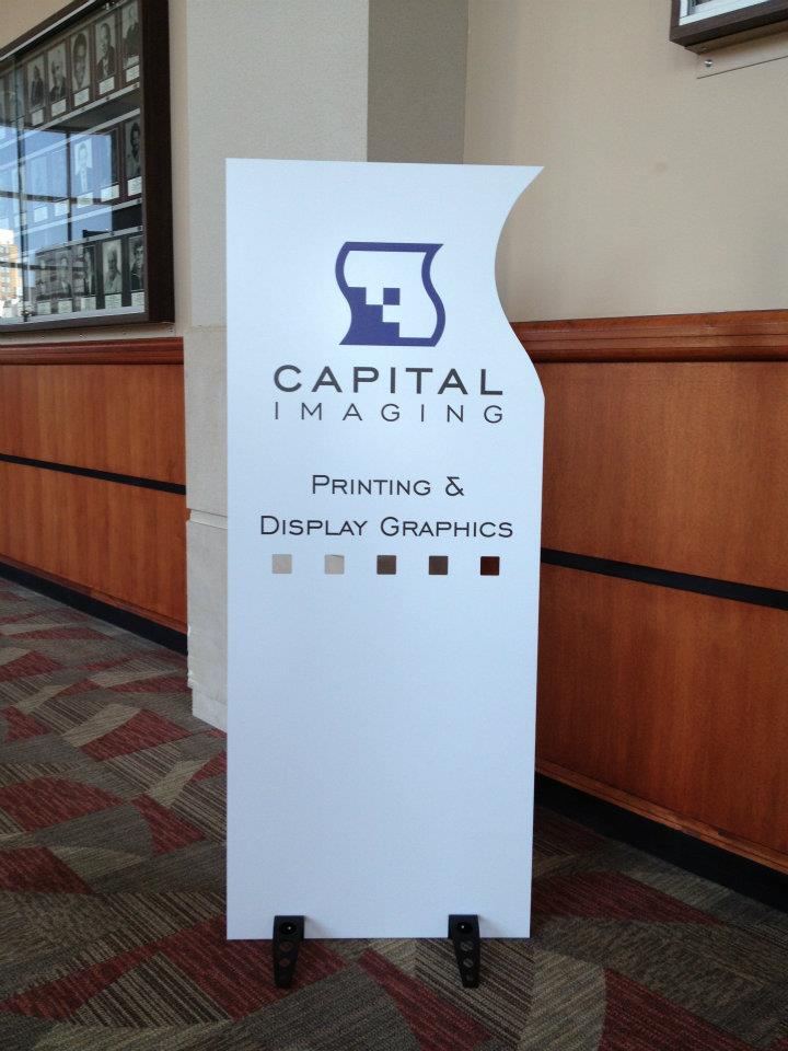
Capital Imaging is the complete visual display and graphics solution for any creative project.Wayfinding and directional signage is crucial in helping people navigate through spaces efficiently. Here are some key points and tips for designing effective wayfinding and directional signage, especially for a university setting like Michigan State University:
Principles of Wayfinding Design
Clarity and Simplicity:
-
- Use simple, clear, and concise language.
- Avoid jargon and complex terms.
Consistency:
-
- Maintain a consistent design theme across all signage.
- Use the same colors, fonts, and symbols throughout.
Visibility and Legibility:
-
- Ensure signs are easily visible and legible from a distance.
- Use high-contrast colors for text and background.
Hierarchy of Information:
-
- Organize information in order of importance.
- Use different sizes and styles to indicate primary, secondary, and tertiary information.
Pictograms and Icons:
-
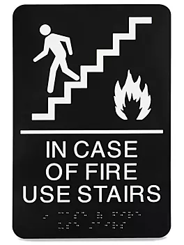
- Incorporate universally understood symbols and icons to aid quick comprehension.
- Ensure they are simple and easy to recognize.
Placement and Positioning:
-
- Place signs at key decision points and intersections.
- Ensure they are at a height and angle that is easily viewable.
Durability:
-
- Use materials that withstand weather conditions and wear and tear, especially for outdoor signs.
Types of Wayfinding Signage
Identification Signs:
-
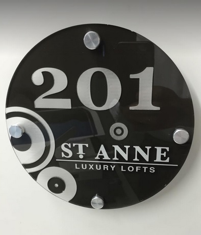
- Indicate specific locations such as building names, room numbers, or landmarks.
Directional Signs:
-
- Provide directions to various destinations using arrows and clear text.
Informational Signs:
-
- Offer general information about the location, such as maps, directories, or campus rules.
Regulatory Signs:
-
- Provide information about rules and regulations, such as no smoking areas, parking regulations, etc.
Design Process
Assessment and Planning:
-
- Conduct a thorough assessment of the area to determine key locations for signage.
- Develop a wayfinding strategy that considers the user experience.
Design Development:
-
- Create design prototypes that align with the university’s branding guidelines.
- Seek feedback from stakeholders and potential users.
Implementation:
-
- Manufacture and install the signage according to the design plan.
- Ensure proper placement and adherence to visibility standards.
Maintenance and Updates:
-
- Regularly check the condition of the signs and update information as needed.
Plan for periodic reviews to ensure the wayfinding system remains effective.
Additional Tips
- Accessibility: Ensure signs are accessible to everyone, including those with disabilities. Use braille, tactile text, and audible signals where necessary.
- Lighting: Consider the lighting conditions and ensure signs are visible both day and night.
- Interactive Elements: Implement digital signs or interactive kiosks to provide dynamic and up-to-date information.
By following these principles and guidelines, you can create an effective wayfinding system that helps students, faculty, and visitors navigate Michigan State University with ease. If you need more specific advice or examples, feel free to ask!
Available Materials
Print on a wide variety of flat materials with remarkable results. We also specialize in ADA and wayfinding signage.Your project is in good hands start to finish.
Check out our full suite of support services. Our seasoned staff strive to be your exclusive professional print partner in bringing your vision to reality.
Are you tired of paying for storage and fulfillment services? Frustrated by reprinting costly marketing materials due to content changes, employee turnover, or damage from poor storage conditions? Capital Imaging offers flexible, on-demand printing with trusted, high-quality results. With our on-demand service, we store your print-ready files digitally, allowing you to restock quickly and easily whenever you need.


